Three gears, one diagram
Same model, same request, three levels of detail. I ran all three on the same day and checked every claim below against the rendered diagrams.
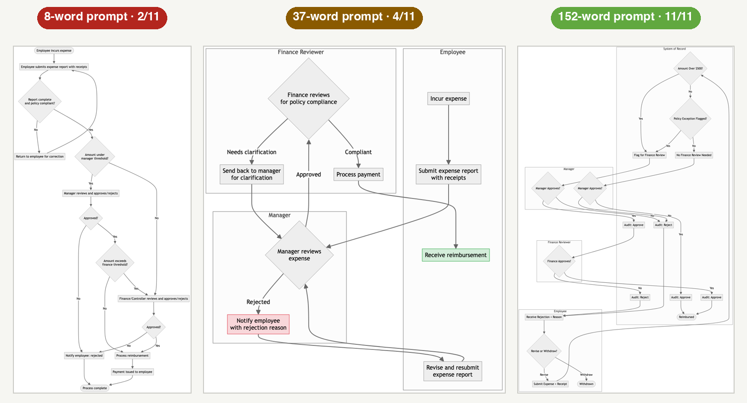
First gear · 8 words
Draw a diagram of an expense approval process.
Second gear · 37 words
Draw a flowchart of an expense approval process. The actors are the employee, their manager, and a finance reviewer. Show the happy path from submission to reimbursement, and show what happens when the manager rejects the expense.
The spec · 152 words
Draw a flowchart of an expense approval process using swimlanes, one lane per actor: employee, manager, finance reviewer, and the system of record. The employee submits an expense with a receipt. The system checks two things in order: whether the amount is over the 500 dollar threshold, and whether a policy exception was flagged. Under-threshold, no-exception expenses go straight to the manager. Anything over threshold or flagged routes to the finance reviewer after manager approval. Every decision point is a diamond with labeled yes/no branches. A rejection at any step returns the expense to the employee with a reason, and the employee can revise and resubmit; show that loop explicitly. Every approve or reject decision writes an audit entry; show audit as a step, not a note. End states: reimbursed, or withdrawn after rejection. Do not include email notifications, currencies, or org charts. Keep labels short, three words or fewer where possible.
2 / 11
8 words · decisions on the page
4 / 11
37 words · decisions on the page
11 / 11
152 words · decisions on the page
| Decision (from the requester's head) | 8 words | 37 words | 152 words |
|---|---|---|---|
| D1 Four swimlanes: employee, manager, finance reviewer, system of record | FAILNo lanes at all; one long column. | PARTIALThree lanes; no system of record (its prompt named only three actors). | PASSAll four lanes present. |
| D2 Submission includes a receipt | PASSGuessed it: “with receipts.” | PASS“With receipts.” | PASS“Submit Expense + Receipt.” |
| D3 $500 threshold decision | PARTIALInvented two unnamed thresholds of its own instead. | FAILNo threshold anywhere. | PASS“Amount Over $500?” diamond. |
| D4 Policy-exception decision | PARTIALA generic “policy compliant?” completeness check. | PARTIALPolicy appears only as finance's review reason, not a routing decision. | PASS“Policy Exception Flagged?” diamond. |
| D5 Routing rule: under-threshold clean expenses stop at manager; over/flagged go to finance after manager | FAILInvented routing: big amounts skip the manager entirely. | FAILEverything goes manager then finance, always. | PASSExactly as specified, including the skip. |
| D6 Decision diamonds with labeled yes/no branches | PASSYes/No labels used. | PARTIALDiamonds yes, but branches labeled with words (Approved, Compliant). | PASSYes/No throughout. |
| D7 Rejection returns to employee with a reason | FAILRejection is terminal; its own assumptions admit it. | PASS“Notify employee with rejection reason.” | PASS“Receive Rejection + Reason.” |
| D8 Explicit revise-and-resubmit loop | FAILOnly a corrections loop before approval; no post-rejection resubmit. | PASSClear resubmit loop. | PASSRevise path re-enters submission. |
| D9 Audit recorded as a step on every decision | FAILNo audit anywhere. | FAILNo audit anywhere. | PASSAudit: Approve / Audit: Reject after every decision. |
| D10 End states: reimbursed, or withdrawn after rejection | PARTIALOne generic “Process complete.” | PARTIALReimbursement end only; no withdrawn. | PASSBoth end states present. |
| D11 Exclusions respected: no emails, currencies, or org charts | PASSNothing excluded appears. | PASSNothing excluded appears. | PASSNothing excluded appears. |
What I found: given eight words, the model didn't draw a vague diagram. It invented a business.
It made up its own approval thresholds, invented a two-tier escalation, and decided that a rejected expense is final,
no resubmission. Nobody asked it to legislate any of that. It's the unmade decision wearing a flowchart.
Name the actors and one behavior, and they show up. Name every decision, and every decision lands on the page.
And one honest note: the 152-word diagram is the most complete of the three, and also the least tidy. The layout
strains as the content grows. Words buy completeness. Beauty still takes iteration.
I ran the same experiment on a working app, graded the same way: the sparse-vs-saturated build report.